
The current article makes the right point, but it needs a clearer distinction between “I’m tired of the way we look” and “the business has genuinely moved somewhere new.”
A good Indian example is Mahindra.
When Mahindra introduced its Twin Peaks identity in 2021, it wasn’t simply because somebody felt the old logo had become unfashionable. The company explicitly tied the new visual identity to a shift in how it wanted its SUV portfolio to be perceived: more sophisticated, more distinctive and more focused on personal exploration and adventure. The XUV700 became the first vehicle to carry it, and the identity was then rolled out across products, dealerships and customer touchpoints.
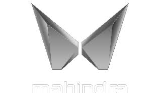
Mahindra’s identity for its SUV portfolio, representing exploration, freedom and the next chapter of its automotive heritage.
The EV range however has a different variant, an almost infinity symbol-ish logo that depicts different reasoning behind it.

An identity designed to express energy, performance, sustainability and a distinctly electric future.
The thinking behind the mark
According to Mahindra’s official design rationale, the symbol communicates four dimensions.
∞ 01 — Infinity: Infinite possibilities
The continuous form represents the flow of energy and the connection between the driver and the vehicle.
It supports Mahindra’s ambition to position its electric range around new experiences and possibilities rather than simply a change in powertrain.
02 — Racetrack: Performance
The looping geometry resembles a racing circuit, referencing Mahindra’s motorsport heritage and its emphasis on exhilarating electric performance.
It reinforces the idea that an electric SUV can be exciting, not merely efficient.
03 — Circularity: Intelligent sustainability
The continuous visual form represents sustainability driven by science and creativity.
Circularity here expresses a broader commitment to responsible mobility, not a literal claim that the vehicle or its materials are infinitely recyclable.
M 04 — The M: Brand heritage
The form also retains Mahindra’s recognisable M, connecting its established automotive identity with its next generation of electric vehicles.
This allows the new identity to look forward without completely abandoning the parent brand’s visual recognition.
That is very different from a 15-person company saying:
“We’ve had this logo for five years. Maybe we need something fresher.”
Five years is not a strategy.
If customers still understand the business, the identity is recognisable and the company hasn’t fundamentally changed, the answer may simply be better typography, better photography, clearer messaging or a more usable website.
Air India is another useful comparison.

Its 2023 identity was introduced as part of the airline’s much wider Vihaan.AI transformation after returning to Tata ownership. The change included the brand identity, aircraft interiors, digital experience, website, app and customer touchpoints. The new website itself introduced streamlined booking flows and new features.
In other words, the visual change followed a much bigger business ambition.
That is usually the better order.
The business changes.
The strategy changes.
Then the identity catches up.
Not the other way around.