
We’ve all seen them.
The homepage opens with a cinematic video. Something floats across the screen. The headline says:
“Transforming tomorrow through meaningful possibilities.”
Lovely.
But what do they actually sell?
You scroll.
Still not sure.
This is the difference between design that attracts attention and design that helps someone understand.
Look at Zerodha.
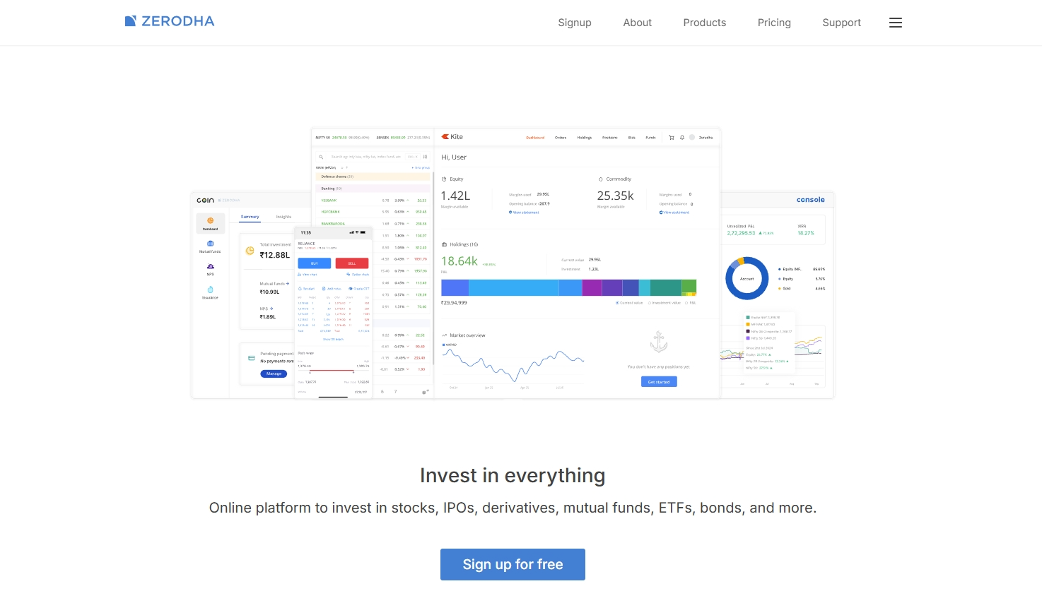
There is nothing especially theatrical about the way Zerodha communicates. Its language tends to be unusually direct, even when it is discussing complex financial products. Zerodha itself has repeatedly talked about the challenge of keeping its products simple while adding features for increasingly experienced investors.
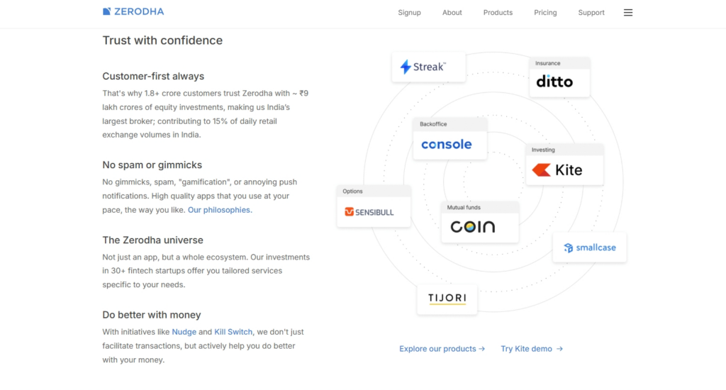
Its educational platform, Varsity, follows the same philosophy. The content is structured into modules and chapters, available freely, responsive across devices and built specifically to make complex investing topics easier to learn.
That is clarity as a design decision.
Compare:
“Empowering financial journeys through next-generation investment ecosystems.”
with:
“Simple and secure, no nonsense investing and trading.”
The second one may not win a copywriting award.
It may, however, help someone understand the business in five seconds and that matters considerably more.
A useful website redesign often starts by removing things.
- One headline instead of three.
- One obvious CTA instead of six.
- Services organised around what customers are looking for rather than what departments exist inside the company.
- Navigation labelled Pricing, rather than Value Ecosystem.
Design doesn’t need to become boring to become clear, it simply needs to stop making the visitor work so hard.
If somebody has to decode your homepage, the problem probably isn’t the font.