SPECTRE K IX
Brand Strategy · Visual Identity · Packaging
Spectre K IX was created as a canine wellness brand built around a simple belief: the products we choose for our dogs deserve the same thought, care and consideration as the ones we choose for ourselves.
The identity brings together credible wellness cues, premium packaging and an unmistakably personal canine character.
Serious wellness. Made for dogs.
CLIENT: Spectre K IX
INDUSTRY: Canine Wellness & Nutrition
SERVICES: Brand Identity, Positioning, Packaging, Visual System
THE CHALLENGE
Pet wellness often sits between two visual extremes: bright, playful mass-market branding and overly clinical health products.
Spectre K IX needed to occupy a more considered space — credible enough to inspire confidence in its formulations, premium enough to stand apart, yet warm and characterful enough to remember who the products are ultimately for.
THE RESPONSE
We created a distinctive identity around the personality at the heart of the brand — Cookie, the founder’s own dog.
A characterful mark, restrained typography and an earthy palette create a flexible identity designed to work across nutrition, wellness and canine care.
THE MARK
At the centre of the identity is Cookie — the founder’s own dog and the inspiration behind the brand.
Rather than creating a generic canine symbol, we illustrated Cookie as the heart of the identity, giving Spectre K IX a story that is personal from the very first glance.
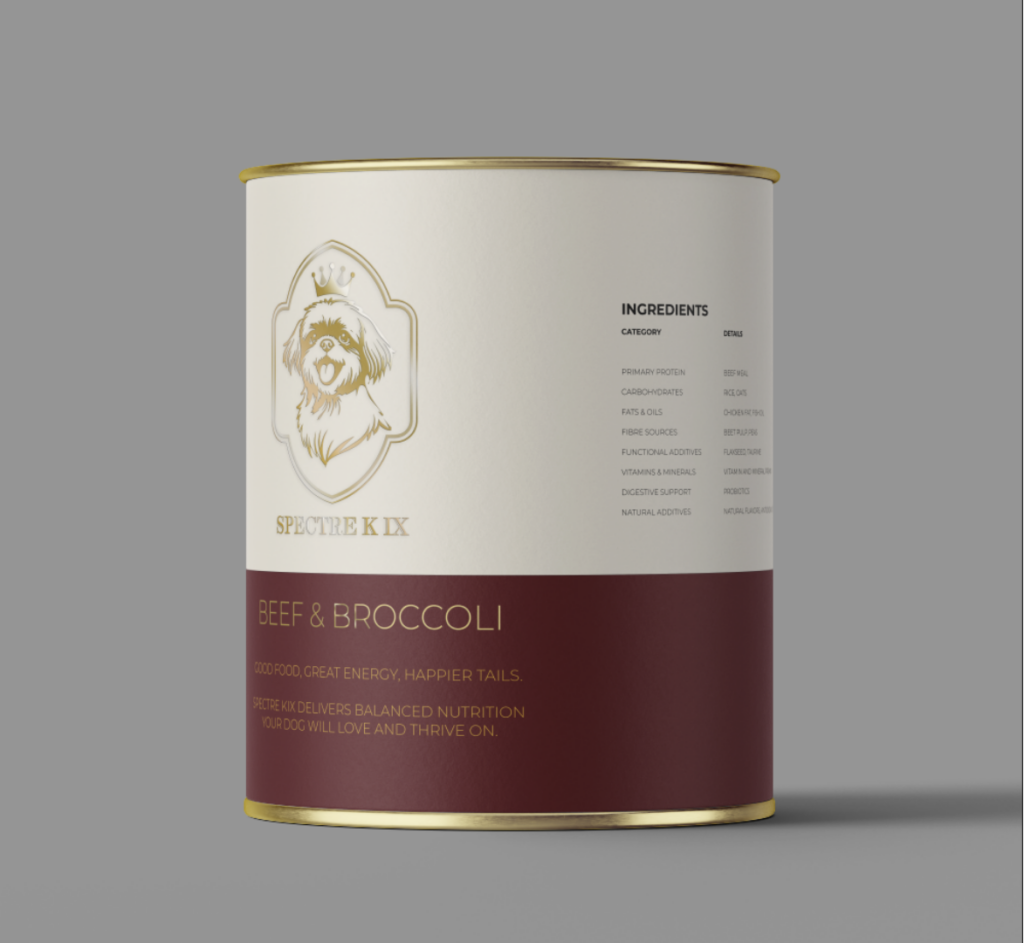
Framed within a refined crest and crowned with quiet confidence, Cookie brings warmth, character and authenticity to an otherwise premium visual language.
It makes the mark more than a logo.
It gives the brand a face, a personality and a reason for being.
PREMIUM, WITHOUT THE PRETENCE
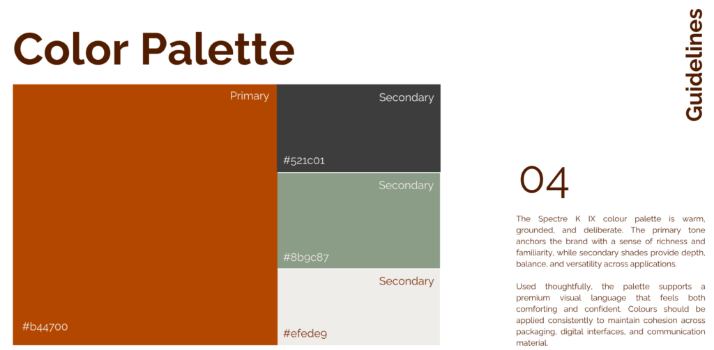
The visual language deliberately steps away from the bright, energetic colours commonly associated with mainstream pet products.
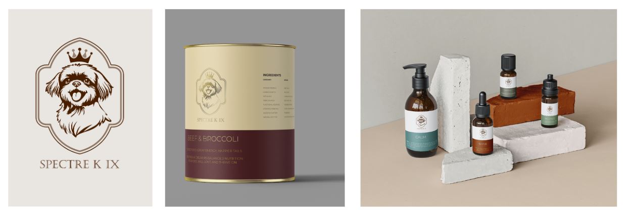
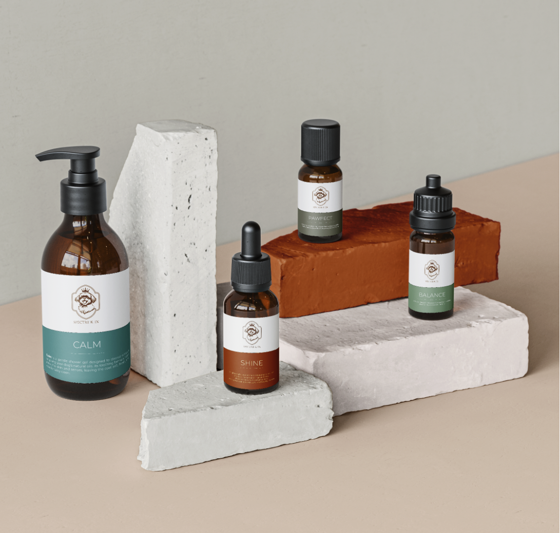
Warm neutrals establish a sophisticated foundation, while burgundy, muted greens and soft blues give individual products their own character.
The palette feels natural and considered without becoming clinical, allowing the products to communicate quality while retaining the warmth expected of a brand built around care.
Used across packaging, labels and communication, the system creates distinction without excess.
DESIGNED AS A SYSTEM
Spectre K IX was never intended to be a single-product identity.
The system was designed to stretch naturally across nutrition, supplements, wellness and care, giving each formulation enough individuality while keeping the family unmistakably Spectre K IX.
Colour, typography and information hierarchy provide flexibility across formats. Cookie remains the constant.
One character. One philosophy. A brand built to grow.
DESIGNED TO EARN TRUST
There is an unusual relationship at the heart of every pet-care brand.
The purchaser is human. The consumer isn’t.
That means Spectre K IX has to communicate on two levels.
It needs the clarity, information and credibility required for an owner to feel confident about what they are buying, while retaining the personality and emotional connection that explains why they care so much in the first place.
The identity was designed around that balance.
– Considered enough to inspire confidence.
– Characterful enough to be remembered.
Built around one very good dog. Designed for all of them.