
MyFaktory.in
Brand Strategy · Visual Identity · eCommerce · Packaging
MyFaktory began not in a warehouse or retail store, but in a cupboard inside the founder’s home.
When her son was born, she discovered something other new mothers were discovering too: good-quality branded children’s clothing could be expensive, while export-surplus clothing offered remarkable quality at far more accessible prices.
What started as a small collection for a circle of mothers grew into a simple idea with much bigger potential – make good clothes for little people easier to afford.
Small beginnings. Happy little customers.
CLIENT: MyFaktory.in
INDUSTRY: Children’s Fashion & eCommerce
SERVICES: Brand Identity, Logo Design, eCommerce Website, Packaging & Tags
THE CHALLENGE
MyFaktory was born from a genuine need rather than a manufactured business proposition. The opportunity was clear: parents wanted well-made, branded clothing for rapidly growing children without having to spend disproportionately on clothes they would soon outgrow.
As the business moved beyond its beginnings at home, it needed an identity that could grow with it — one that felt approachable and joyful, but credible enough to turn a small home-grown venture into a recognisable retail brand.
THE RESPONSE
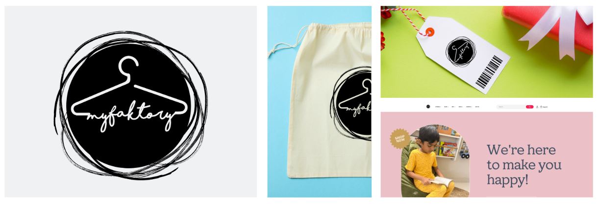
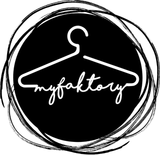
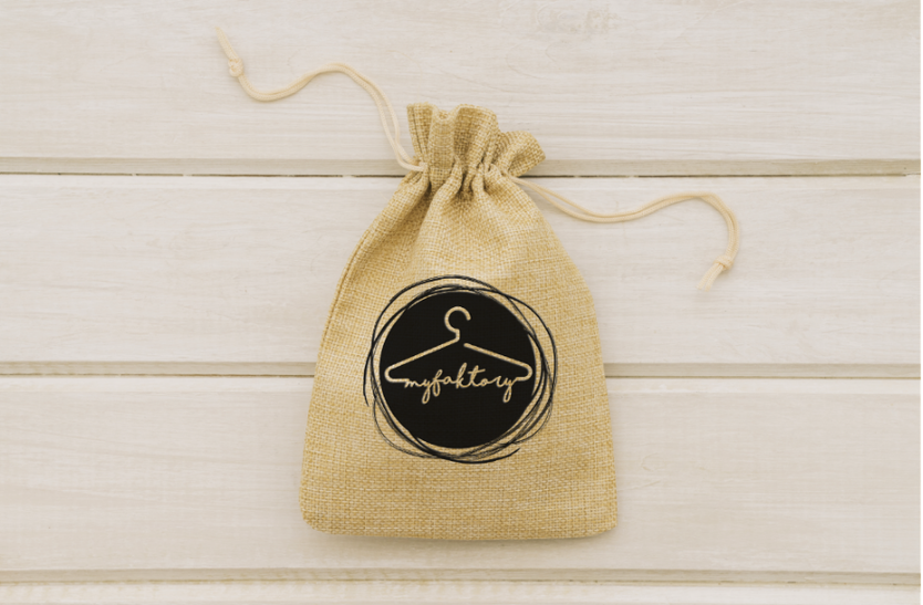
We created a simple, characterful identity built around one of the most universally recognisable symbols of clothing – the hanger.
Paired with a handwritten wordmark and an intentionally imperfect illustrated frame, the identity captures the personality of the business: informal, friendly and uncomplicated.
That visual language was then carried through to the packaging and into an eCommerce experience designed to make discovering and buying children’s clothing equally simple.
THE MARK
The Hydra symbol uses an organic, fluid visual language to create a distinctive signaturAt the heart of the identity is the hanger.
Familiar, immediate and unmistakably connected to clothing, its simple outline creates the framework for the handwritten myfaktory wordmark.
The hand-drawn treatment surrounding the mark deliberately avoids feeling overly polished or corporate. There is movement, imperfection and personality in it, qualities that sit naturally alongside a brand created at home and built through personal relationships with other parents.
The result feels less like a conventional fashion label and more like what MyFaktory has always been:
Personal, practical and made with a little bit of heart.
PACKED WITH PERSONALITY
The origins of MyFaktory became an important part of how we thought about the identity.
There was no need to manufacture a grand story. The real one was better.
A new mother discovered access to quality export-surplus clothing. Other mothers wanted the same thing. A cupboard at home became inventory. Word spread. And a small idea began becoming a business.
The identity therefore needed to preserve some of that intimacy even as MyFaktory grew.
We weren’t trying to make a small business look big.
We were helping a good idea look ready to grow.
FROM HOME TO ONLINE
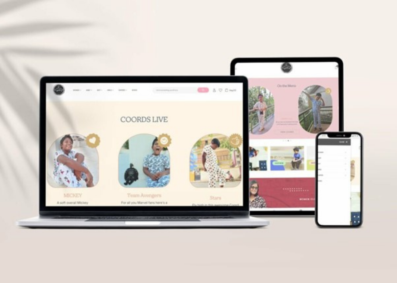
As MyFaktory grew, the website became the bridge between a business built through personal recommendations and a much larger community of parents.
The eCommerce experience was designed to retain the friendliness of the original business while making shopping simple and intuitive.
Bright imagery, playful graphic elements and generous use of colour create a world that unmistakably belongs to children, while a straightforward product structure keeps the experience firmly focused on shopping.
And the central proposition remains refreshingly uncomplicated:
We’re here to make you happy.
MyFaktory’s story is ultimately one of a small observation becoming a real business.
The founder recognised that parents shouldn’t have to choose between good clothes and sensible prices. What began as a cupboard of export-surplus children’s clothing became a brand capable of reaching families well beyond that original circle of mothers.
Our role was to give that idea an identity, a place to live online and the everyday brand touchpoints it needed to grow.
Not to make it something it wasn’t, but to make what was already special easier to recognise.
From one cupboard to countless little wardrobes.