Toka Koka Studio
Brand Strategy · Visual Identity · eCommerce
Toka Koka Studio is a contemporary jewellery brand built around pieces that carry the character of Indian craft without being bound by convention.
The identity needed to feel distinctive, artistic and rooted while remaining minimal enough to let the jewellery take centre stage.
Tradition, drawn differently.
CLIENT: Toka Koka Studio
INDUSTRY: Jewellery & Accessories
SERVICES: Brand Identity, Visual System, Packaging, eCommerce
THE CHALLENGE
Toka Koka’s jewellery is expressive, detailed and strongly influenced by Indian forms and craftsmanship. The challenge was to create an identity with enough personality to belong alongside the work, without competing with it. It needed to feel contemporary without losing its cultural character, and distinctive enough to remain recognisable across packaging, physical applications and a product-led digital storefront.
THE RESPONSE
We built the identity around the name itself.
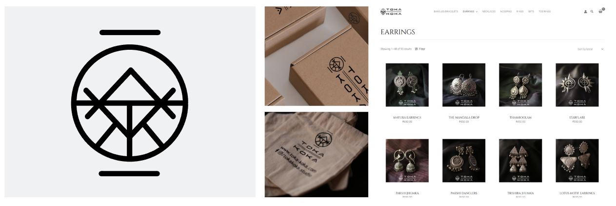
Rather than creating a separate decorative symbol, the letters of T O K A K O K A were deconstructed, abstracted and brought together to create a single geometric mark.
The result is an identity that rewards a second look, much like the jewellery itself.
THE MARK
At first glance, the Toka Koka symbol appears to be an abstract geometric form. Look closer, and the story reveals itself.
The mark is constructed from the letters that make up T O K A K O K A,
layered and connected into a single visual signature.
Circles, lines, angles and intersections allow the individual letterforms to disappear into the whole, turning the brand name into its own icon.
It gives Toka Koka a symbol that is not merely placed alongside the name.
The name is the mark.

ORDER WITHIN ORNAMENT
Toka Koka’s products are rich in detail, texture and form. The identity deliberately takes the opposite approach.
A largely monochromatic visual language gives the jewellery room to command attention, while the geometry of the mark provides a recognisable thread across every application.
The contrast is intentional: an expressive product world held together by a restrained identity.
From packaging and tags to fabric, stamps and digital applications, the mark can appear quietly without losing its character.
DESIGNED TO LEAVE AN IMPRESSION
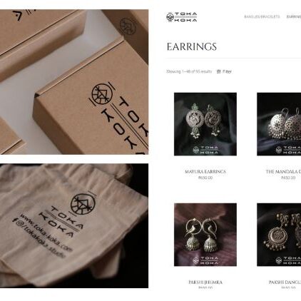
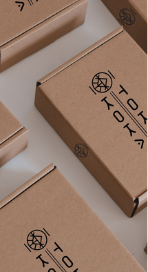
Packaging was treated as part of the brand experience rather than simply a container for the product.
The identity translates naturally into stamps, labels, boxes and fabric applications, allowing simple materials to become unmistakably Toka Koka.
The result is deliberately understated.
The jewellery creates the drama. The brand creates the memory.
FROM CRAFT TO COMMERCE
The digital experience follows the same principle.
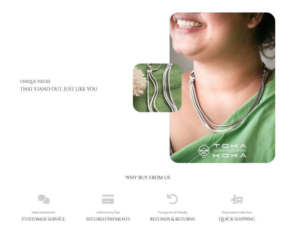
With products that are already visually intricate, the website was designed to step back using generous whitespace, restrained typography and a clear product architecture to make discovery effortless.
The identity remains present without overwhelming the shopping experience, allowing individual pieces, collections and their stories to take precedence.
The result is an eCommerce experience that feels less like a catalogue and more like a carefully curated collection.
Eight letters. One mark. Unmistakably Toka Koka.