Hydra Dermatology
Brand Strategy · Visual Identity · Brand System
Hydra Dermatology was envisioned as more than a clinical identity. The brand needed to reflect the precision and credibility of modern dermatology while retaining the sense of care, refinement and personal attention expected from a premium practice.
The identity is built around this balance.
Where science, care and confidence meet.
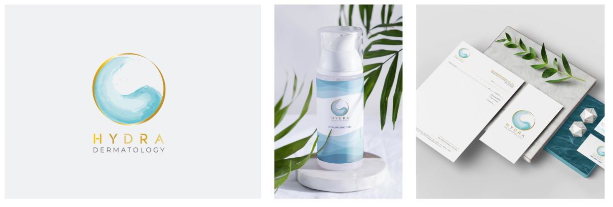
CLIENT: Hydra Dermatology
INDUSTRY: Healthcare
SERVICES: Brand identity, Guidelines, Positioning, Packaging.
THE CHALLENGE
Dermatology brands can quickly fall into familiar visual territory: clinical blues, generic beauty imagery and communications that feel either overly medical or overly cosmetic. Hydra needed an identity that could communicate expertise and care while still feeling contemporary, warm and distinctive.
THE RESPONSE
We developed a restrained identity system built around clarity, confidence and quiet sophistication. A considered palette, refined typography and a flexible visual language allow the brand to feel premium without becoming inaccessible.
THE MARK
The Hydra symbol uses an organic, fluid visual language to create a distinctive signature for the brand. Its layered forms suggest renewal, movement and transformation – ideas closely connected with skin health and the constantly evolving nature of dermatological care.
Rather than relying on the familiar visual clichés of medical branding, the mark is deliberately more expressive. It gives Hydra an identity that can belong equally comfortably in the worlds of clinical expertise, skin health and sophisticated personal care.
There is a sense of movement within the form, but also structure. That tension reflects the philosophy behind the brand: advanced science delivered with considered, individual care.

A palette of science and sophistication
The cool aqua spectrum brings freshness, clarity and calm to the identity.
These tones have an inherent association with purity, hydration and wellbeing, but their layered treatment gives them greater depth than a conventional clinical palette.
Gold introduces a contrasting note of warmth and distinction.
Used selectively, it moves the brand away from the visual language of a conventional clinic and towards something more considered and premium, without compromising its medical credibility.

Together, aqua and gold create the central visual tension of the brand: clinical clarity balanced by quiet luxury.